MavenWorks
Graphing Calculator
This is a fun project that will walk you through some of the more advanced bits of Maven dashboarding, creating an animated 2D graphing calculator with a time slider and an expression editor.
Wireframing
Wireframing is always a good first step in designing a dashboard. It helps clarify your thinking, and gives you a product you can begin iterating on right away. This allows you to have shorter ‘dev’ cycles, to keep you from over- investing in something users might not need or want.
Let’s outline the requirements:
- A graph
- A time slider
- An expression editor
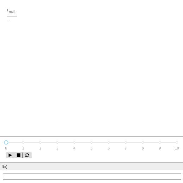
Requirement 1 is simple- we’ll use a PivotPart for this. 2. can be met with an Animation Slider, and for 3 we can use a Text Input part. Now that we’ve identified the parts we want to use, let’s add them to our dashboard.
Re-arrange them until they look good to you. Remember that you can open the designer at any time with (Ctrl+D) to make fine-tuned adjustments! For this dashboard, you may want to try a layout like this:
Globals
Now that we have the wireframe, let’s determine what state will need to be shared. We need the Expression synced up to the text box, the time synced up to the slider, and both of those synced up to the graph. That means we’ll need 2 globals:
GraphFunction(String)Time(Number)
Add these globals via the Globals Editor (Ctrl+G) and go
ahead and bind them. Time should be bound to the slider value, and
GraphFunction should be bound to the text box. Hold off on binding them to the
graph, we’ll get to that next.
Query
Iterating on a query is sometimes a little difficult in an output part. Let’s create a SlickGrid and use that to help us write our query. Click on the Pivot Part and create a new SlickGrid in-place with Alt+T. Now, open the Query Editor with Ctrl+E, Ctrl+Q and set the query type to MQL.
Let’s start with a lattice. Enter the following query and hit “Apply”:
SELECT
    x
FROM
    Lattice('x = -10 to 10 step 0.1')
You should see the slickgrid update with a set of numbers growing from -10 to 10, just as we specified in the lattice.
MQL Functions
Now, let’s create a simple MQL function. MQL functions are similar to those in
other SQL dialects, and begin with a DEF.
DEF @f(@x) = @x * @x

SELECT
    x,
    @f(x)
FROM
    Lattice('x = -10 to 10 step 0.1')
Now we’re getting somewhere! Now, let’s use that time global and integrate it with our query. Recall that MQL lets you bind to globals (just by referencing them):
DEF @f(@x, @t) = @x * @x + @t

SELECT
    x,
    @f(x, @Time)
FROM
    Lattice('x = -10 to 10 step 0.1')
Now when you hit “Play” on the animation slider, the SlickGrid should update.
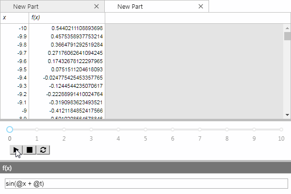
MqlEval
Now that we’ve got a function, let’s make it editable! For this, we’ll use the MqlEval function. MqlEval lets you turn a string into the body of a DEF. Let’s see how it works:
DEF @f(@x, @t) = MqlEval(@GraphFunction, 'x', @x, 't', @t)

SELECT
    x,
    @f(x, @Time) as [f(x)]
FROM
    Lattice('x = -10 to 10 step 0.1')
At this point, you should be able to edit the expression in the text box and have the SlickGrid update. Set it to something like the following:
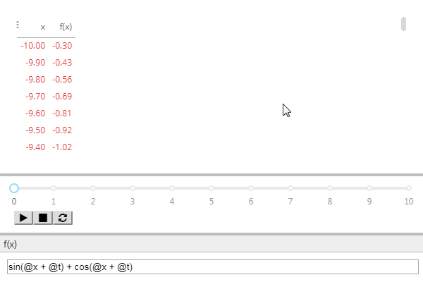
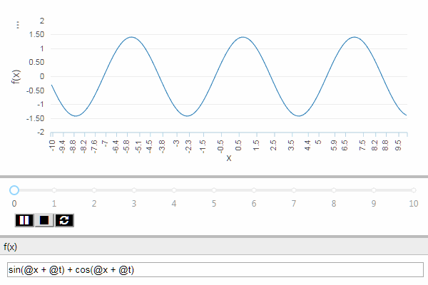
sin(@x + @t) + cos(@x + @t)
Putting it all together
Now, close the Query Editor and let’s shift our focus back to the Pivot Part. There’s a convenient shortcut to copy options from one part to another, let’s use that to save us some time. Click on the SlickGrid and press Ctrl+ Shift+C. This copies the MQL binding to an internal buffer that we can paste from.
Now, switch to the PivotPart and press Ctrl+Shift+V. This pastes the binding from that buffer, which in this case is the MQL query that we had on the SlickGrid. Close the SlickGrid tab, since we don’t need it anymore.
You should now see this in the pivot part:
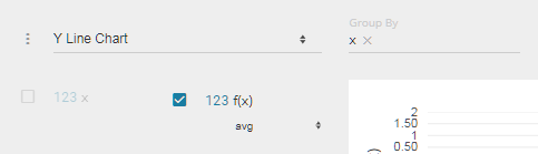
Now, expand the Perspective UI by clicking on the triple dots on the upper left, and in the dropdown in the upper left change the visualization to “Y Line Graph”.
From the columns in left, drag “x” to the Group By box at the top. Now, in the columns on the left again look for the “f(x)” column and select it.
Your UI should look like this:
Now close the Perspective UI by clicking on the triple-dots again, and voilà! You now have a fully functioning, animated graphing calculator!
Note
You may wish to disable the calculating overlays on the PivotPart, as they will briefly flash on occasion. To do this, open the Part Properties Editor (Ctrl+E, Ctrl+P) and set the layout property “Show Overlays?” to “False”.